BCU
Precision-Targeted Marketing
My work with BCU required wicked organization, communication, attention to detail…and a grid in InDesign. working closely with a copywriter partner, I created and versioned dozens of versions of direct mail pieces and email mockups that adhered strictly to BCU's in-depth brand guidelines. BCU is a credit union, and with my years of experience working with financial clients, I knew that meant very tight regulations on the copy and legal lines. Ensuring that each version of each piece had the correct copy, correct format, correct specs, I designed and packaged mockups of emails for BCU’s developers, and keylined and proofed some of these nifty half-fold mailers.
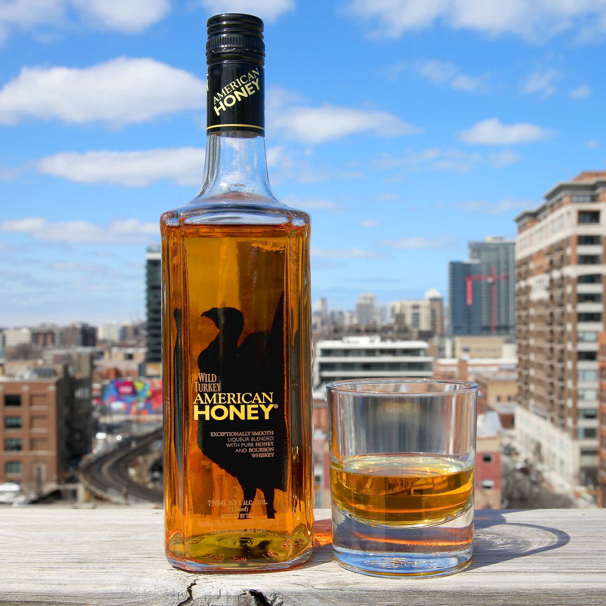
WILD TURKEY AMERICAN HONEY
Working at American Honey’s AOR, I worked on a variety of projects with one mission: inspire people to put down their phones and socialize.
Attention-Grabbing Banner Ads
You’re never too cool to make banner ads. Working with my Creative Director and client feedback, I created banner ads to spec using assets supplied by the client, assets from our video department, and assets created from scratch when necessary. The end results were competent, clear banner ads which lived on Onion Inc sites.
Social Media: Selling Whiskey with Fake News
Working in a team to pump out social post after social post, I did whatever the post copy called for: creating brand-friendly templates, Photoshopping together pictures, selecting stock imagery, photography and touch-up, etc.
Making Commercials: Graphic ASsets for Video
I worked alongside and under the direct supervision of the Sr. Graphics Editor to create image assets used as props in video ads. In the “Selfie Addicts” episode of “Social Media Bar,” we took selfies of the actress against a plain background and edited them into backdrops per the script. These photos were then printed, framed, and used as props in production.
Rage God
"Heart Reacts Only" EP Package
Chicago rapper Rage God approached me to design a flight of artwork for his EP "Heart Reacts Only" and its singles. The artwork needed to stand out on streaming platforms, both looking vibrant and modern at full scale and being instantly recognizable as a thumbnail when scrolling through playlists.
Bare-bones compositions that prominently feature iconic emoji imagery, simple typography, and his logo are wrapped up in a spacy atmospheric environment that reflects the sound of the music. Monolithic emoji and heart reactions floating in space are tongue-in-cheek and self aware, but subtle gradients, sleek design, and beautiful cloud rap texture demonstrate that Rage God is a current rapper worth taking seriously.
Rage God has a magnetic personality, distinct sound, and a solid photographic identity. Now, cool-looking graphics fit neatly into the picture with the rest of his material.
Elgin Art Showcase
Modernizing an Existing Brand
Elgin Art Showcase was in desperate need of visual rebranding, and they approached me to modernize their look. The new logo is measured, geometric and official, with letter forms reminiscent of origami or sculpture. The logo is paired with simple sans serif type, a beautiful red, and a subtle texture that adds excitement and movement without sacrificing cleanliness.
Below is the new branding implemented on a poster, which takes heavy cues from Swiss Design. The look feels established, modern, and confident. It commands attention, but has the credibility to trust that it will make your attention worth your while.
Incentivefox
Sleekly Branded, Tech-Savvy Social Media Flights
Incentivefox does referral marketing through technology: streamlined digital referral programs that are a breeze for both the customer and the dealer.
When I joined the team, I saw an opportunity to establish consistent social media posts. I took their existing brand colors, logo, and type choices and boiled them down into a consistent set of brand guidelines. Suddenly, our social media presence had a sharp boost in brand recognition, credibility, and style.
Armed with new templates and pages of new, youthful post copy, we made some genuinely fun image posts that look great and set Incentivefox apart.
Streamlined Branding applied to Print Materials
As my time with Incentivefox continued, we began applying this same consistent brand guide to all graphical elements of the business. Roboto font family, Flat 2.0 design, modern stock imagery and futuristic custom icons were implemented in prepaid debit cards, card carriers, flyers, and sell sheets such as the one pictured. I created highly organized, easy-to-use Adobe templates for all materials so that future designers could pick up and use these crisp new designs with ease.
Onion Labs
Social Media Shareables Concept
My Creative Director tasked me with designing a template we could use to share comedic marketing and advertising industry content on our social media accounts. I combined the look of existing Onion Instagram posts with Onion Labs’ branding, with just a hint of those posts you ignore on LinkedIn from your high school classmate (seriously, why does he post them every day?).


